Landing page redesign
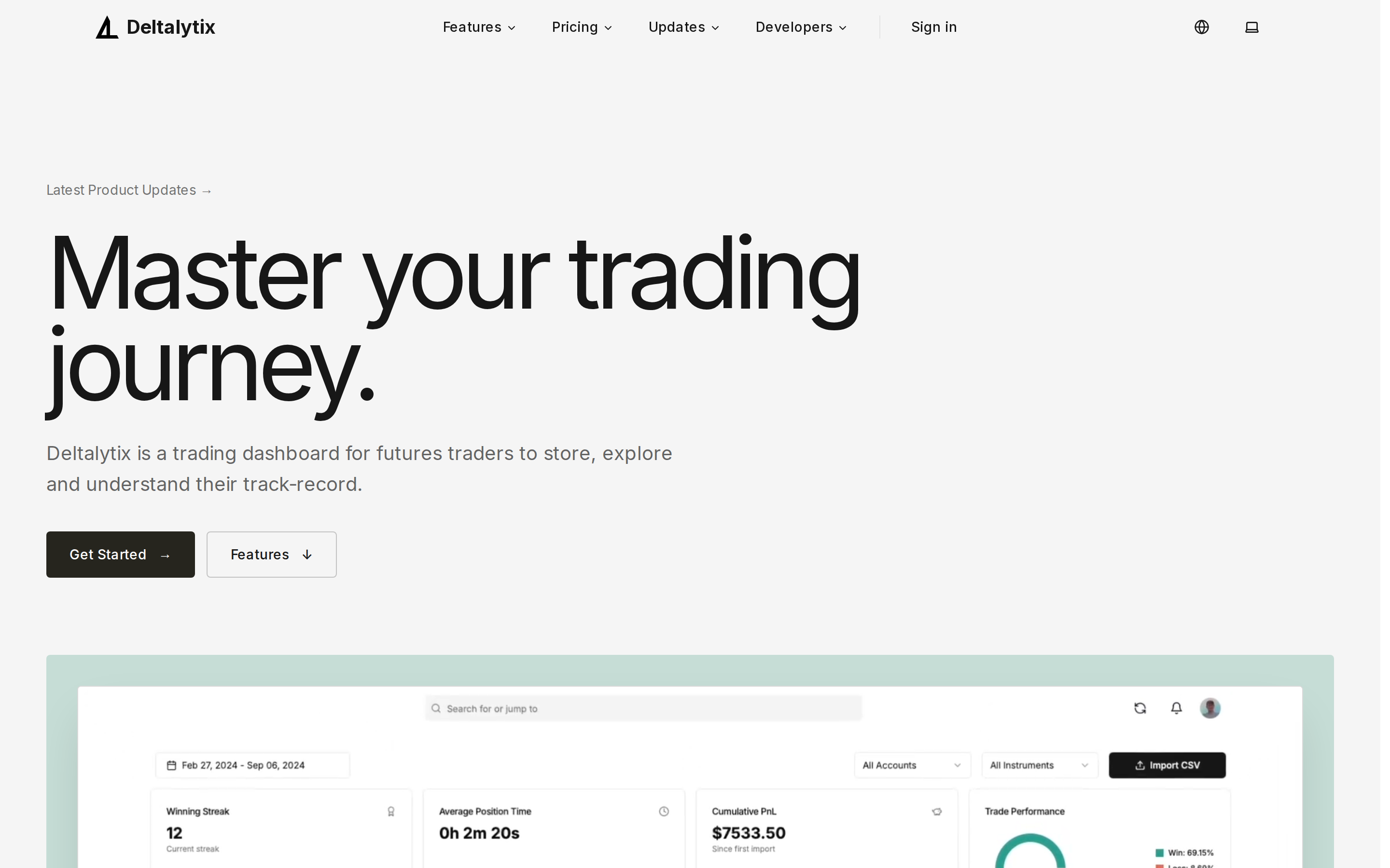
The public homepage got a full visual refresh. The hero uses larger typography, a mint-accented product demo frame, and a direct link to the latest product updates. Partner logos sit right under the hero, and the page flows as one continuous scroll through features, pricing, FAQ, and the open-source section.
Features are now a numbered, editorial list—AI journaling, performance charts, calendar, performance tracking, and data import—instead of a dense bento grid. Sections are separated with subtle borders, and heavy blocks still lazy-load with skeleton placeholders so the page stays fast.